LOGOS
I like to work collaboratively with my clients when I'm helping them create something as important as their logo. This mark is what people will see and feel when they think of their company. This means ideas can come from anyone and we're honest about what is and isn't working – Open communication has always led to the best results.
Libertas Hair Salon
Libertas is Latin for Liberty.
"It’s about creating a place that feels bold, strong, and unbridled, but is also a place where you can be free to be yourself, whether that be quirky, professional, lazy, uptight, whatever – You be you, we cut your hair."
– Galen, Co-owner of Libertas Hair Salon
We talked a lot about having the name being the primary focus of the mark, but stayed open to the idea of a combination mark.
I began to sketch several possible directions, focusing on letterforms that were strong and bold, but without feeling stiff, constrained, and still had character.
Sketches: Round 1
Sketches: Round 2
I send grayscale vectorized logos so that the focus is on design rather than color
Vectors: Round 1
Vectors: Round 2
A few more rounds of revisions and refining details, such as the number of stripes on the torch, angle of line edges and spacing
Two variations of the finalized mark for different use cases.
Janet Taing Real Estate
Realtor, Managing Broker, ABR, CNE, GRI
Most northwest realtors work under bigger companies, such as Windermere, Coldwell Banker, and Keller Williams –
Janet needed a way to separate herself from the rest.
We came up with a design reflective of Janet's friendly personality and her care and connection with her clients.
Farmer Willie's Craft Ginger Beer
Logo mark Revision
Farmer Willie's wanted to refresh their logo mark (Farmer Willie's face) with a bolder, friendlier looking Willie.
The current brand is focuses on their backstory, being ginger-forward taste, with a playful, humorous twist.
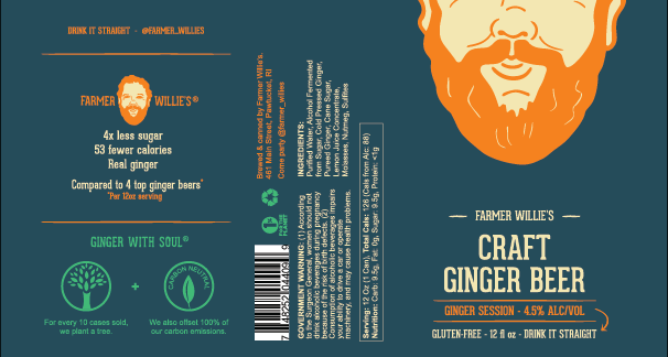
The clever branding for their cans.
The real Farmer Willie.
Some use cases of how logo is being used.
OLD FACE
REFRESHED FACE
The thin lines of the old face get lost when shrunk down. He also looks a little dry in his expression.
Studying the real Farmer Willie, I wanted to bring back the twinkle in his eyes and Santa-like jolly cheeks.
The refreshed face has bolder, more uniform lines, and closer resembles the real Farmer Willie.
*Ultimately, the company is going an entirely new route with a complete rebrand –
focusing on their ingredients rather than backstory.


